ELMO Design System
A new design system for ELMO to elevate UX and Accessibility
ELMO Software is a trusted leader in HR technology solutions, supporting over 3,000 organizations and reaching 2 million users across Australia, New Zealand, and the UK.
The challenges
As ELMO rapidly expanded its product suite, challenges emerged in maintaining a consistent design language, cohesive user experience, and a single source of truth for code. Although we had a component library, it was outdated, with inconsistent typography, missing documentation, and entirely different design systems across applications—creating a complete mess.
ELMO needed a new design system to simplify the design and development process and provide users with a consistent experience that truly reflects the brand's personality.
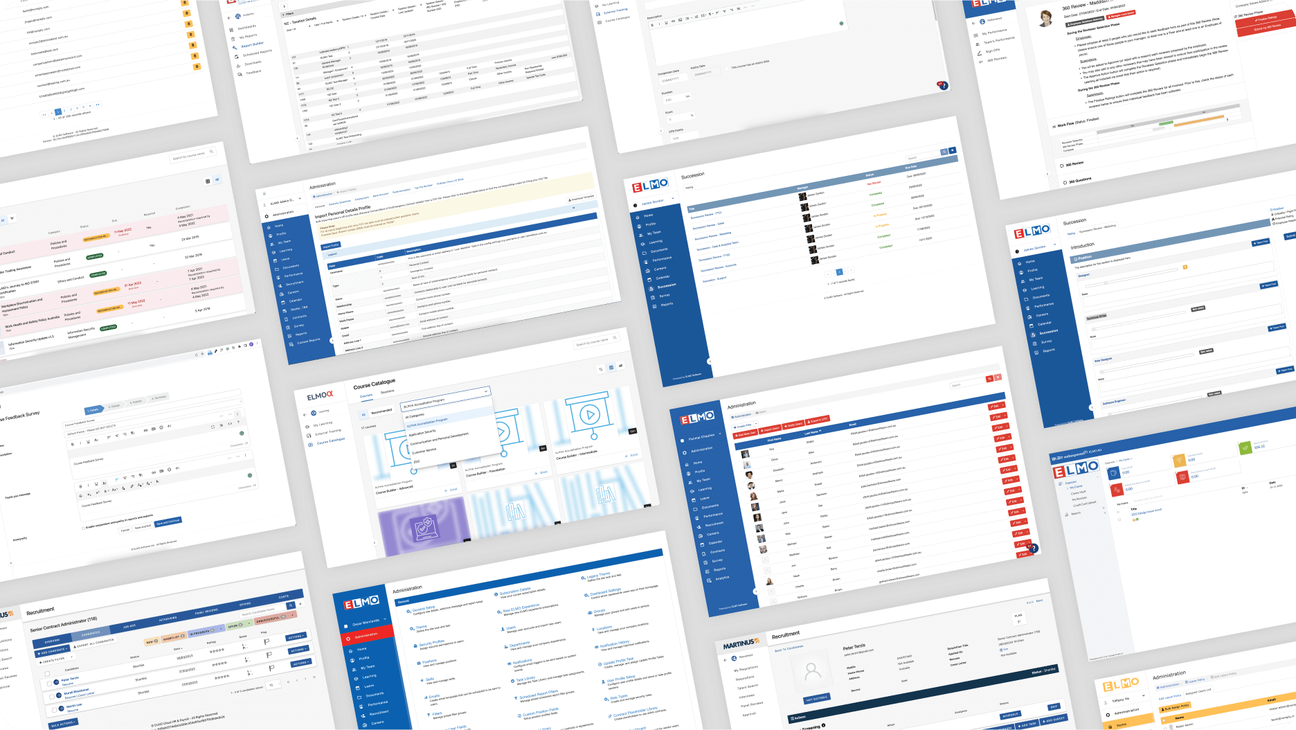
Curious to see the old system? Take a look at the image below!
My role and duties
I contributed to setting a high standard for component documentation within our design team. Through close collaboration between designers and developers, we established an elegant design language that prioritised consistent UX, accessibility, and developer experience, enabling us to deliver compelling, high-quality software.
My role in EDS included:
- Conducting design audits across all modules to identify user challenges and pain points.
- Analysing customer insights to inform design decisions.
- Creating components and detailed guidelines in Figma.
- Design review sessions with designers, engineers, and stakeholders to refine the designs.
- Collaborating closely with engineers, reviewing documentation site pages against Figma guides, and providing feedback
- Maintaining an up-to-date Figma UI library and patterns by creating and updating new components.
- Supporting and educating UX researchers and product designers.
- Pressure testing the design system components and patterns by creating product designs.
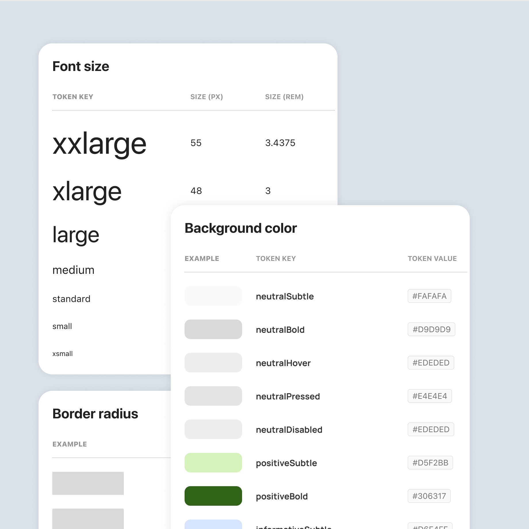
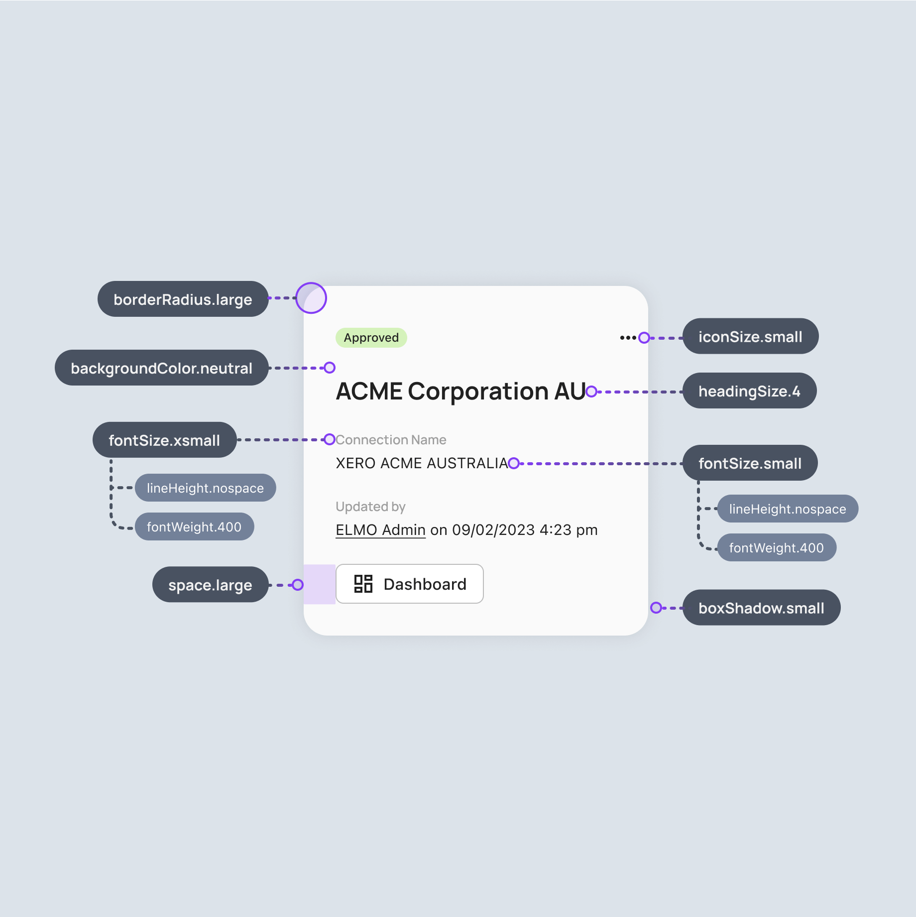
A robust and considered token system
This system was developed through close collaboration across all team disciplines, built on a foundation of shared understanding and meticulous attention to detail. By establishing these core elements early on, we laid a strong foundation for a cohesive design language that ensures long-term consistency across the design system.
We established variables in Figma for colors, sizes, spacing, and radius, validating them through initial mockups. To maintain consistency, we worked closely with engineers to align token values between Figma and the documentation site.
To view the token documentation visit, https://eds.docs.elmotalent.com.au/foundations/tokens/
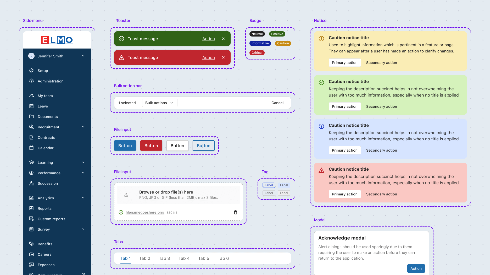
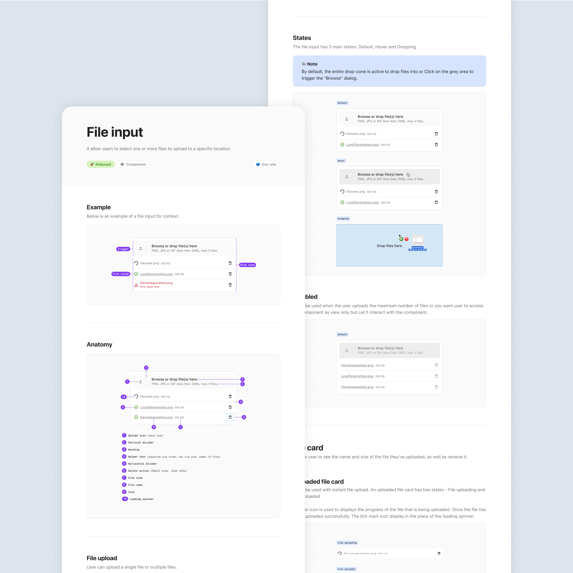
Component design and documentation
Component design and guideline
I conducted a thorough design audit across all products to understand the specific use cases, behaviors, and challenges of each component. Based on these insights, I carefully crafted component designs and guidelines in Figma, covering small and medium sizes, various states, additional props, and placement options. The comprehensive guidelines include details on anatomy, behaviour, sizes, and states, ensuring clarity and usability. I collaborated closely with the design team for reviews and engaged in early syncs with engineers as needed. Developers used this Figma component and guide as a reference to build the components on the doc-site.
Single source of truth
We meticulously documented these components alongside the design language in a world-class documentation site powered by Next.js and Contentlayer. From live-editable code examples to automatically generated prop API specifications, the site enables frictionless adoption and provides a one-stop-shop for both maintainers and consumers of EDS. crafted a comprehensive library of components that bring user accessibility and developer experience to the forefront.
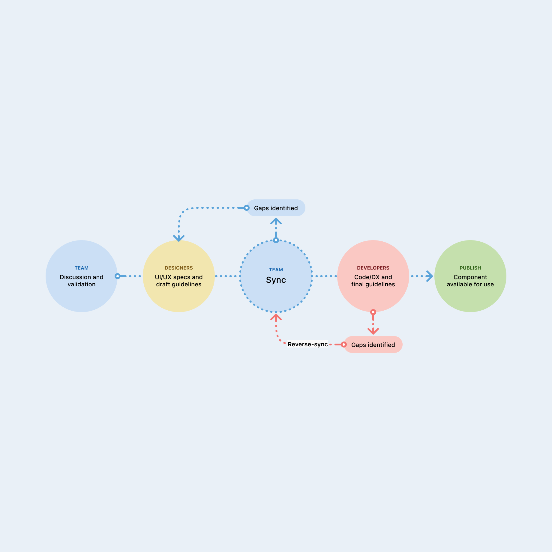
EDS Way Process
We’ve followed “EDS way” process In sync sessions, the EDS team collaborates to review design and development artifacts, ensuring cohesive user experiences across components and flows. It starts with validating new component needs, followed by a designer drafting initial specifications and holding syncs to gather early feedback from both designers and developers. As the component progresses, further syncs may occur as needed, with developers taking over for implementation. If issues arise during development, the team conducts a “reverse-sync” for collaborative problem-solving. Once complete, the component is previewed and finalised for EDS release.
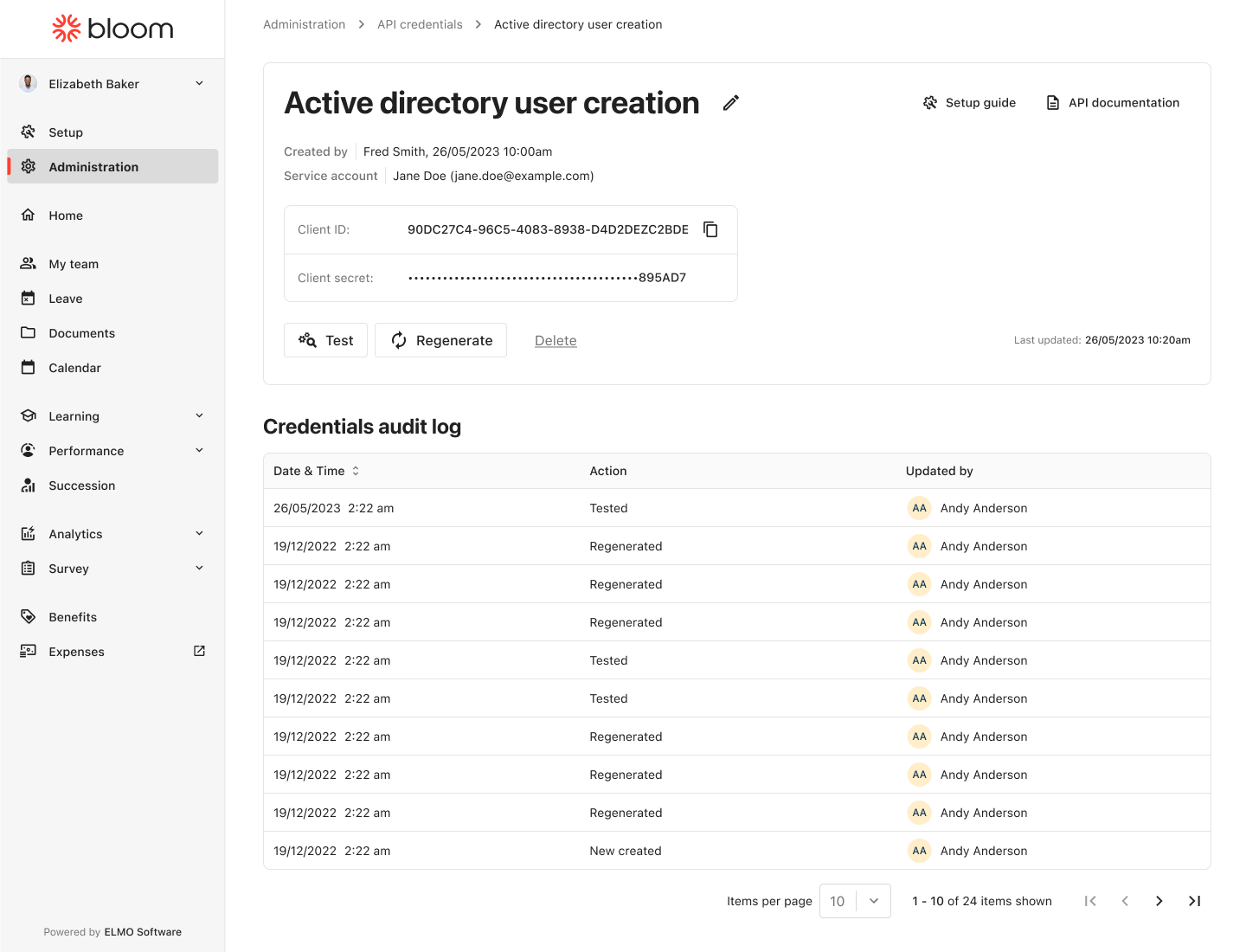
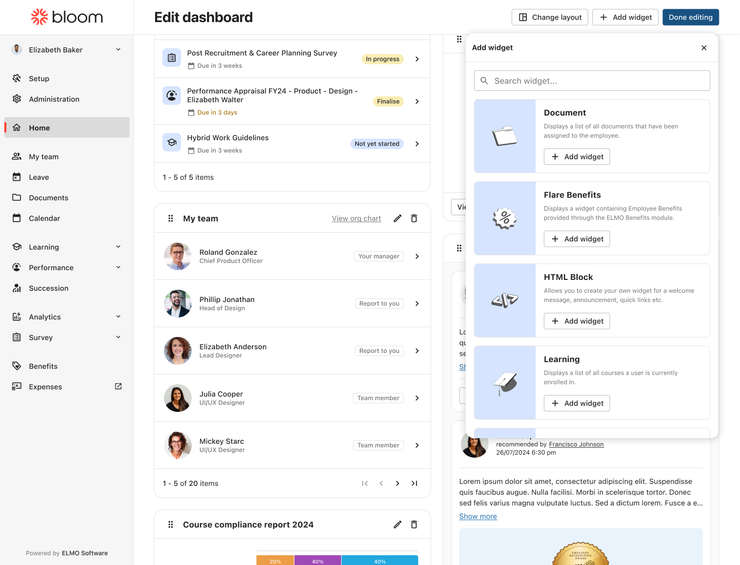
Continuous Evolution with EDS
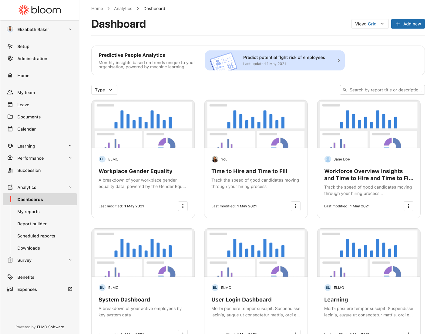
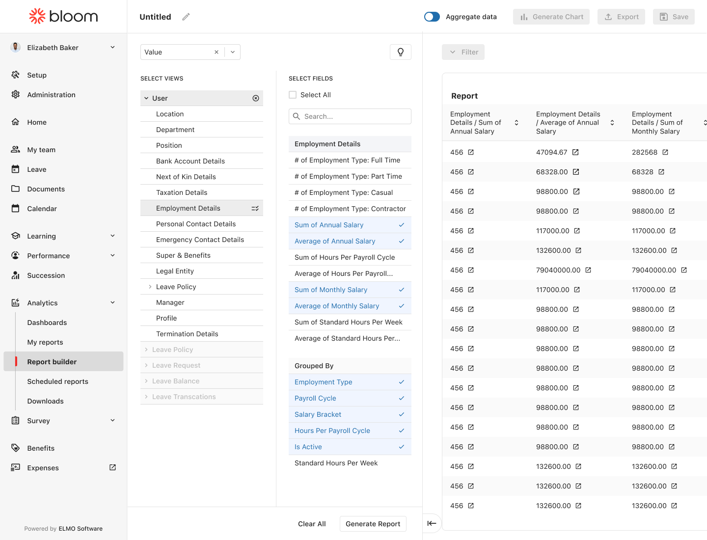
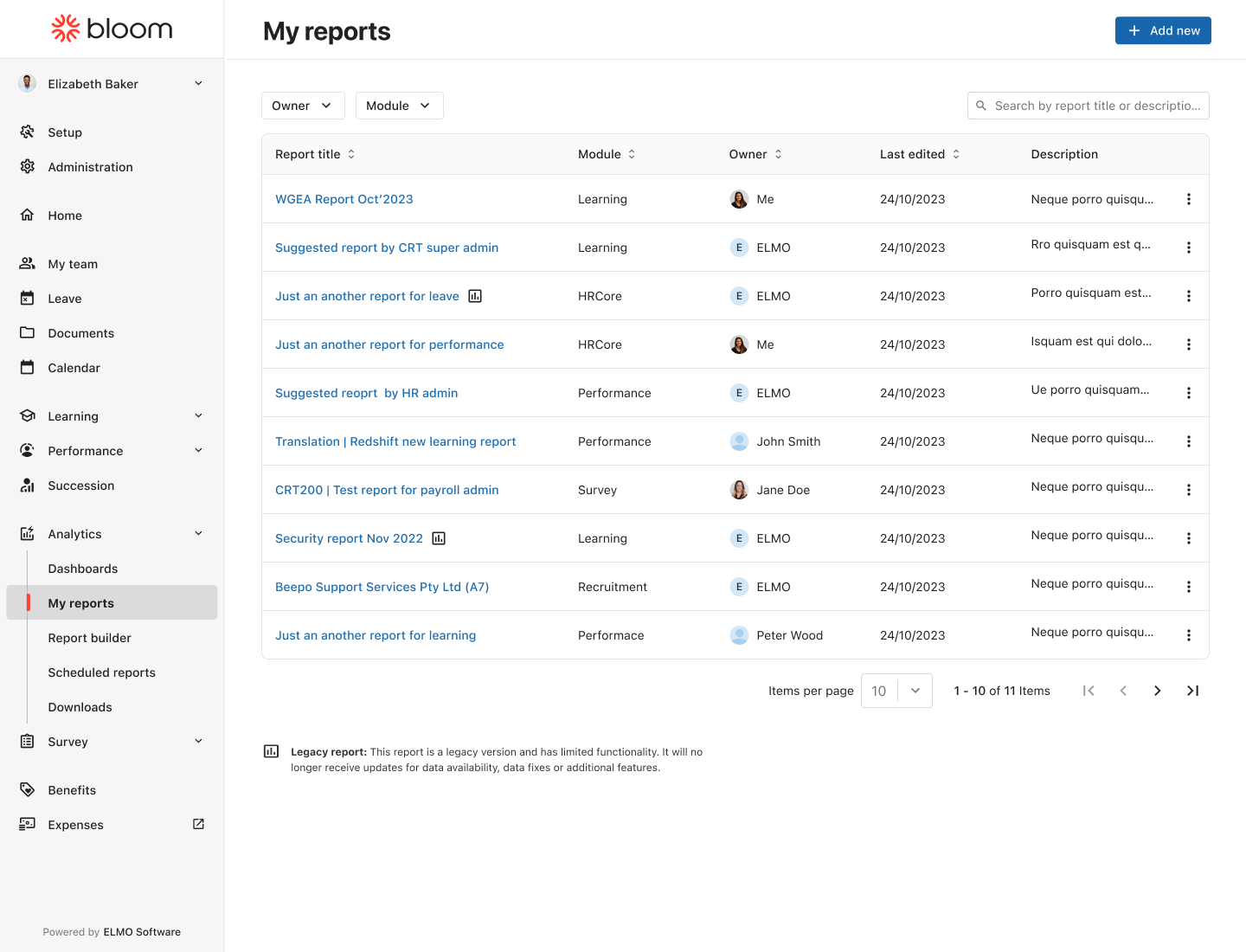
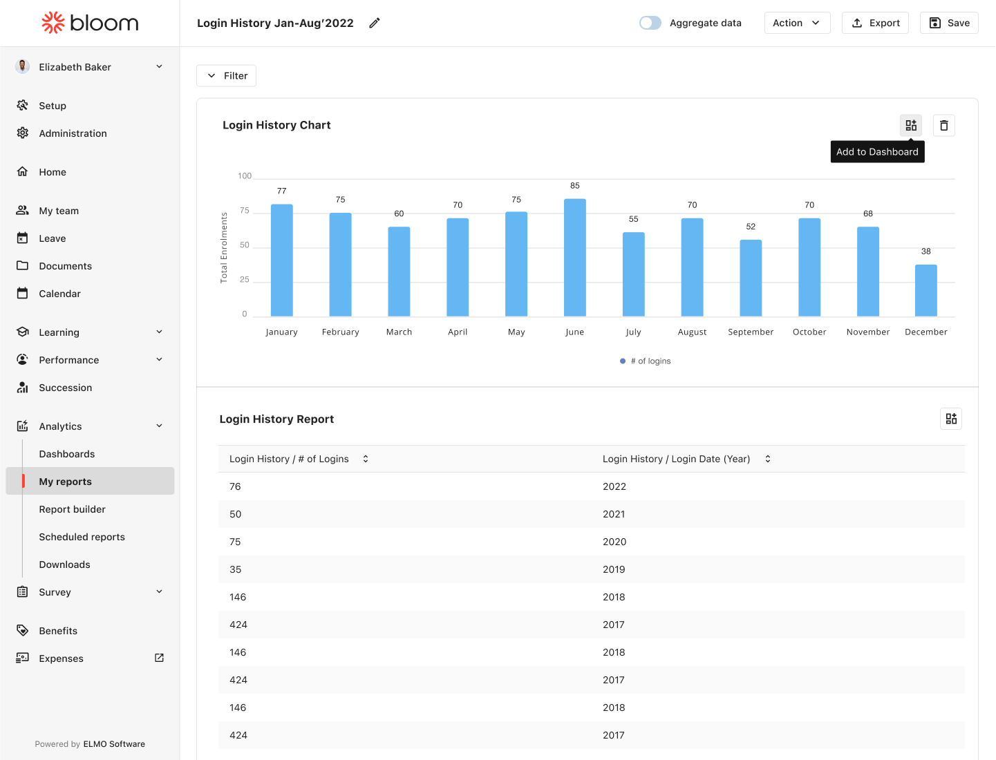
Once the design system was established, we began using it to redesign various modules. Throughout the process, we consistently refined the system by updating existing and adding new components to address both user and business needs. Below is a sneak peek of some of the recent projects I've updated using EDS.